Aurelia Forms Components
| Version | Date | Notes | By |
|---|---|---|---|
| 0.8 | 2018-10-23 | Added documentation to explain the new generic tree filter for selector type components (select2, multi-select, etc ...) | ROB |
| 0.7 | 2018-08-20 | Updated datetimepicker documentation | ROB |
| 0.6 | 2018-03-05 | Date Time Picker changes | ROB |
| 0.5 | 2017-12-06 | Date Time Picker | ROB |
| 0.4 | 2017-08-11 | Predefined Select2 form components | ROB |
| 0.3 | 2017-08-11 | Label sorter | ROB |
| 0.2 | 2017-08-11 | ACBIN Duallistbox | ROB |
| 0.1 | 2017-02-22 | Initial release | JFM |
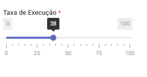
Slider
The slider component uses the ion-rangeslider plugin
For more advanced usage, check the documentation on the oficial github page here: https://github.com/IonDen/ion.rangeSlider
How does it look
When to use it
Best use when you need to set percentages.
How to use it
Simply set the property type to slider in a aurelia form field. Setting are available via the settings property.
this.name = {
    type:     'slider',
    key:      'rate',
    label:    'form.field.rate',
    size:     2,
    settings: {
        step:    25,
        postfix: '%'
    },
};
The default settings are:
defaultSettings = {
    type: "single",
    grid: true,
    min:  0,
    max:  100,
};
ACBIN DualListBox
This will eventually replace the standard dual list box
This component performs exactly the same functions as the standard dual list box, except it can also be filtered by other form fields.
this.plan_audit_area_items = {
    type:               'acbin-duallistbox',
    key:                'plan_audit_area_items',
    label:              'form.field.audit-area-items',
    size:               12,
    options:            [],
    remoteSource:       viewModel.repository.activeAuditAreaItems.bind(viewModel.repository),
    additional_filters: [ // aditional filters (by other fields)
        {
            // provide a reference to the model or other object that the field is bound to
            model: viewModel.model,
            // name of the model variable containing the filter value
            model_field: 'plan_audit_area',
            // name of the variable in the combo that contains the value to filter by
            remote_source_field: 'audit_area_id'
            // note: the combo will have to return (in this case) id, name and audit_area_id for this to work
        }
    ],
    required:           false
};
The remote source field can be either an id or an array of ids (ex: [1,2,3])
Label Sorter
This component allows you to sort numbers or strings using drag and drop. The id in the options can be sorted into an array of ids or a solid string (default is solid string)
this.code_order = {
    type:     'labelsorter',
    key:      'code_order',
    label:    'form.field.code-order',
    size:     4,
    required: false,
    output:   'string', // this controls the output format
    options:  [ // this is where the available options are placed
        { id: 'd', name: 'form.field.mask' },
        { id: 'e', name: 'form.field.edition_mask' },
        { id: 'r', name: 'form.field.revision_mask' }
    ]
};
Tree View / Selector for Select2 / MultiSelect
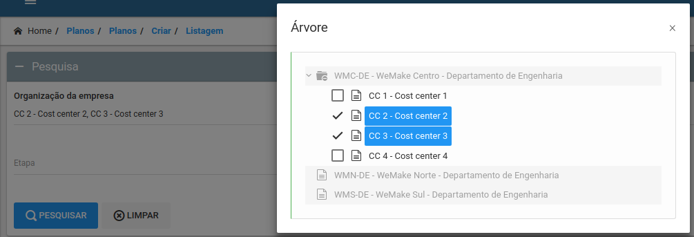
Any select2 / multiselect component may be enhanced by the use of a tree view. This opens up a modal with a tree version of the content that the selector already displays. From this view, a selection (or multiple selections) may also be made. To use this system just add the following:
this.filter_company_organizations = {
    type:       'company-organizations-local-multiselect',
    key:        'filter_company_organizations',
    label:      'form.field.company-organizations',
    size:       4,
    options:    [],
    required:   false,
    inputGroup: {
        position: 'right',

        // create a tree filter button
        treeFilter: {

            // tree filter settings
            filterParameters: {
                // callback for the select event
                select: (event, data) => {
                },

                // callback for the click event
                onClick: (event, data) => {
                },

                // force the global use / hiding of checkboxes
                checkbox: false

                // the following settings must allways be present
                // (This will be reworked at a later date)
                extensions: [],
                persist:    null,

                // define the repository from where the tree version of the select2 / multi-select
                // data will be retrieved.
                repository: {
                    source: repositoryInstance,
                    method: 'nameOfRepositoryInstanceMethod',
                    params: { // repository instance method parameters defined here
                        param1: 1,
                        param2: 2
                    }
                }
            }
        }
    }
};
If the new tree filter is opened inside a modal created without aurelia-modal system, it will display behind it. It is recomented to move all modals (especially ones where this system is required) to the new modal system.
This system can also function with a preexisting settings class like so:
this.filter_company_organizations = {
    type:       'company-organizations-local-multiselect',
    key:        'filter_company_organizations',
    label:      'form.field.company-organizations',
    size:       4,
    options:    [],
    required:   false,
    inputGroup: {
        position:   'right',
        treeFilter: new SeparatesDataTreeFilter(viewModel, null, 'filterModel', 'filter_company_organizations', this)
    }
};
Each setting class is different and requires different constructor parameters. In the case of the
SeparatesDataTreeFilterandSeparatesDataTreeFilterSingle, they handle the various eventsselect,onClick, etc ... internally, so do not require that these be defined in the view model.
Predefined Select2 form components
There are a few select2 fields that have been created as shortcuts for commonly used select2 comboboxes in SGI v10, for these select2 combos you do not have to provide a remoteSource parameter (they have one built in) just call them like in the example bellow:
this.responsible_id = {
    type:  'users-select', // can also be 'boolean-options-select' or 'boolean-statuses-select'
    key:   'responsible_id',
    label: 'form.field.responsible-for-implementation',
    size:  6
};
Date Time Picker
This component combines the date and time picking functionalities into one form component. By default it is set to act as a date picker, see the options bellow to configure it further:
Since 2018-03-05 this component now uses the picker located at: http://t00rk.github.io/bootstrap-material-datetimepicker/
All the other parameters required before 2018-03-05 are obsolete, the format controls the behaviour of the component (if the format has a time component, then the time picker will be show)
| Name | Description | Default | Extra Info |
|---|---|---|---|
| format | controls the format of the output | "YYYY-MM-DD" | Please note that the format used is no longer the php format but the moment.js format (see moment js for more information) |
| min_date and max_date | Controls whether the user can select a date smaller than min date or bigger than max date | null | The allowed format is "yyyy-mm-dd" or a javascript object with the following {model: modelContainingMinDate, param: parameterOfMinDate} |