Datatables
| Version | Date | Notes | By |
|---|---|---|---|
| 0.3 | 2017-08-28 | Changes to selectable variable | ROB |
| 0.2 | 2017-02-27 | Changes mad to the edit/destroy route | JFM |
| 0.1 | 2017-01-31 | Initial release | FPA |
This document will quickly guide you through the configuration and usage of the datatables plugin that will be responsible to render a listing table.
1. Intro
The datatables plugin does not only share the name with the well known DataTables plugin, it is highly inspired by it and was created with the intention of making available most of its functionalities but in a Aurelia way.
2. Responsibilities
This plugin's main responsibility is to communicate with the remote server and retrieve a collection of data to display in a table. Besides that, it also allows to easily sort (in a ascending or descending way) the data based on a given column, filter and paginate the records. In this last matter, it allows the user to define how many records he wants to display at each page.
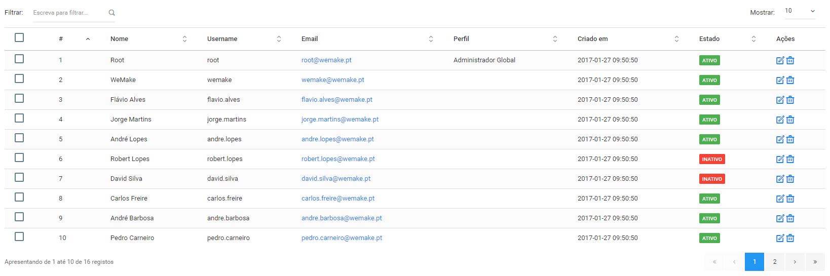
This is how a typical datatables listing will be looking. The table data will be updated in real-time each time the user takes an action - filter, sort, paginate, etc.
3. Developer guide
3.1 View-Model
In our view model we only need to add two variables: listingId and datatable.
The first one must contain a unique id that will identify our listing across all application (it is necessary because we can have more than one listing rendered at the same time).
export class ListUsers extends BaseViewModel {
    listingId = 'administration-users-listing';

    // ... more view-model stuff here
}
The convension assumed for the listingId variable is: module_slug - entity -listing. In our example above. administration is the module slug and users is the entity.
The second variable, datatable, must contain a javascript object that represents the datatable schema. A simple example of the structure this object can have is presented below.
this.datatable = {
    repository: this.repository,
    edit:       'administration.users.edit',
    destroy:    'administration.users.destroy',
    actions:    [
        {
            icon:    'icon-file-pdf',
            action:  (row) => this.openReport(row),
            tooltip: 'form.button.export-to-pdf'
        },
        {
            icon:       'icon-file-excel',
            action:     (row) => this.exportToExcel(row),
            tooltip:    'form.button.export-to-excel',
            visible:    (row) => row.created_by === this.appContainer.authenticatedUser.user.id,
            attributes: {
                class: ''
            }
        }
    ],
    buttons:    [
        {
            attributes: { 'data-toggle': 'model' },
            label:      'form.button.create_new_f',
            icon:       'icon-plus3',
            className:  'btn bg-success',
            action:     () => {
                // do something
            }
        }
    ],
    selectable: true,
    sorting:    {
        column:    0,
        direction: 'asc'
    },
    columns:    [
        {
            data:  'id',
            name:  't00_users.id',
            title: '#'
        },
        {
            data:  'name',
            name:  't00_users.name',
            title: 'form.field.name'
        },
        {
            data:  'username',
            name:  't00_users.username',
            title: 'form.field.username'
        },
        {
            data:  'email',
            name:  't00_users.email',
            title: 'form.field.email',
            type:  'email'
        },
        {
            data:  'role',
            name:  't00_role_translations.name',
            title: 'form.field.role'
        },
        {
            data:  'created_at',
            name:  't00_users.created_at',
            title: 'form.field.created_at'
        },
        {
            data:  'status',
            name:  't00_user_status_translations.name',
            title: 'form.field.status',
            type:  'label'
        }
    ]
}
Below is a table of contents describing each property of the schema object.
| Part | Type | Required | Description | Observations |
|---|---|---|---|---|
| repository | Object | Yes | The repository object that will be used to fetch the data from | |
| edit | String / Boolean | No | The route name for the edit page | If only true is passed, datatables assumes that the current route ends with index and the edit route end with edit. That way, datatables gets the current route and replaces index with edit. Alternatively it can be an anonymous function with the pretended logic |
| edit | String / Boolean | No | Option to destroy the record | true to show the option, false of not declared to not show the option. Alternatively it can be an anonymous function with the pretended logic |
| actions | Array | Yes | An array of objects that represents each extra action button | Will be explained in detail later in this page |
| buttons | Array | Yes | An array of objects that represents each extra button | Will be explained in detail later in this page |
| selectable | Boolean / Function | Yes | Indicates if the table will have the first column with the checkboxes, if function is used it will receive the current row as the first parameter and the return must be a boolean | for the function use case, it will allow for controlling the rows on which the checkbox will appear |
| sorting | Object | Yes | An object containing the sorting settings | Will be explained in detail later in this page |
| columns | Array | Yes | An array of objects that define each table column | Will be explained in detail later in this page |
3.1.1. actions
this.datatable = {
    // ...
    actions: [
        {
            icon:    'icon-file-pdf',
            action:  (row) => this.openReport(row),
            tooltip: 'form.button.export-to-pdf'
        },
        {
            icon:       'icon-file-excel',
            action:     (row) => this.exportToExcel(row),
            tooltip:    'form.button.export-to-excel',
            visible:    (row) => row.created_by === this.appContainer.authenticatedUser.user.id,
            attributes: {
                class: ''
            }
        }
    ],
    // ...
}| Part | Type | Required | Description |
|---|---|---|---|
| icon | String | Yes | The icon class |
| action | Function | Yes | An anonymous function that receives the corresponding row and executes something |
| tooltip | String | Yes | The translation slug for the tooltip we want to present |
| visible | Boolean/Function | No | Indicates if the action button will be visible. It can be a boolean or an anonymous function that returns a boolean |
| attributes | Object | No | An object with attributes that will be added to the html element |
3.1.2 buttons
this.datatable = {
    // ...
    buttons: [
        {
            label:      'form.button.create_new',
            icon:       'icon-plus3',
            className:  'btn bg-success',
            action:     () => {
                // do something
            },
            attributes: {
                'data-toggle': 'model'
            },
        }
    ],
    // ...
}| Part | Type | Required | Description |
|---|---|---|---|
| label | String | Yes | The translation slug for the label we want to present |
| icon | String | Yes | The icon class |
| className | String | Yes | The button class |
| action | Function | Yes | An anonymous function that executes something |
| attributes | Object | No | An object with attributes that will be added to the html element |
3.1.3 sorting
this.datatable = {
    // ...
    sorting: {
        column:    0,
        direction: 'asc'
    },
    // ...
}| Part | Type | Required | Description |
|---|---|---|---|
| column | Integer | Yes | The column index of the column we want to sort by. |
| direction | String | Yes | The sorting direction. asc for ascending or desc for descending |
3.1.4 columns
this.datatable = {
    // ...
    columns: [
        {
            data:  'id',
            name:  't00_users.id',
            title: '#'
        },
        // ...
        {
            data:  'status',
            name:  't00_user_status_translations.name',
            title: 'form.field.status',
            type:  'label'
        }
    ]
    // ...
}| Part | Type | Required | Description |
|---|---|---|---|
| data | String | Yes | The object property name that we want to use with this column |
| name | String | Yes | The field name in database - table_name.field_name |
| title | String | Yes | The translation slug for the column title |
| type | String | No | The column content type. It can be null, label or email |
3.2 View
Now that we know what we need to put in our view-model and how to define a datatable schema, to render a table the only code line you will need to put in your view is the following:
<datatable schema.bind="datatable" listing-id.bind="listingId"></datatable>| Part | Description |
|---|---|
<datatable></datatable> |
The custom element that represents the plugin |
| schema.bind="datatable" | Binds the datatable variable of the view-model to the plugin variable called schema |
| listing-id.bind="listingId" | Binds the listingId variable of the view-model to the plugin variable called listingId |
3.3 Activate or deactivate selected records
When using this feature we can optionally use either one or both.
In order to implement activate/deactivate selected:
-
optionally in the schema:
activateSelected, show or hide activate selected button, by default is hiddendeactivateSelected, show or hide dactivate selected button, by default is hidden
-
required methods to have in the repository that is binded to the schema:
activateSelected, method that call the backenddeactivateSelected, method that call the backend
Example:
repository.js:
  /**
 * Activate given records
 *
 * @param data
 * @returns {*}
 */
activateSelected(data)
{
    return this.httpClient.post('administration/modules/activate', data);
}
api.php
Route::post('modules/activate', ['as' => 'api.administration.modules.activate-selected', 'uses' => 'ModulesController@activateSelected']);
Route::post('modules/deactivate', ['as' => 'api.administration.modules.deactivate-selected', 'uses' => 'ModulesController@deactivateSelected']);
controller.php
Import trait to simplify the work:
use WeMake\Sgi\Core\Http\Controllers\Traits\DefaultStatusAction;Create the necessary methods:
  /**
   * Activate the selected resources.
   *
   * @param UpdateStatusRequest $request
   * @param Module              $model
   *
   * @return JsonResponse
   */
  public function activateSelected(UpdateStatusRequest $request, Module $model): JsonResponse
  {
      return $this->defaultActivateSelected($request, $model);
  }

  /**
   * Deactivate the selected resources.
   *
   * @param UpdateStatusRequest $request
   * @param Module              $model
   *
   * @return JsonResponse
   */
  public function deactivateSelected(UpdateStatusRequest $request, Module $model): JsonResponse
  {
      return $this->defaultDeactivateSelected($request, $model);
  }