Using Custom Elements
| Version | Date | Notes | By |
|---|---|---|---|
| 0.1 | 2016-01-13 | Initial release | JFM |
TODO: missing custom elementsThis intent of this document is to provide a list of all the custom elements we need to create interfaces in the SGIV10. how they look, when should we used them and how to use them.
Custom Elements
Only the core team have the permission to create/alter or to allow the creation/alteration of custom elements. If you need a new custom element or you need to change one, you should contact the core team
This is not the documentation on how to create a custom element. If you need that you should check the Custom Elements Guide
Our framework have already some custom elements built-in to facilitate the development of interfaces. This section cointain a list of the currently available custom elements and how to use them.
Sometimes custom elements can be used without any javascript behind it, but usually you need to have to bind values, properties, etc.. to your viewmodel.
Usually you have to use all these elements inside the main container element, wich is the panel-group element.
accordion & accordion-section
How does it look?

When to use it?
How to use it?
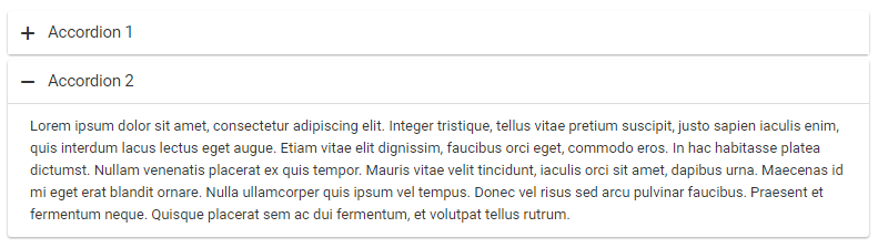
<accordion>
    <accordion-section title="Accordion 1" control-id="id1">
        <div class="col-md-12">
            Content of Accordian 1
        </div>
    </accordion-section>

    <accordion-section title="Accordion 2" control-id="id2">
        <div class="col-md-12">
            Lorem ipsum dolor sit amet, consectetur adipiscing elit. Integer tristique, tellus vitae pretium suscipit, justo sapien iaculis enim, quis interdum lacus lectus eget augue. Etiam vitae elit dignissim, faucibus orci eget, commodo eros. In hac habitasse platea dictumst. Nullam venenatis placerat ex quis tempor. Mauris vitae velit tincidunt, iaculis orci sit amet, dapibus urna. Maecenas id mi eget erat blandit ornare. Nulla ullamcorper quis ipsum vel tempus. Donec vel risus sed arcu
            pulvinar faucibus. Praesent et fermentum neque. Quisque placerat sem ac dui fermentum, et volutpat tellus rutrum.
        </div>
    </accordion-section>
</accordion>
datatable
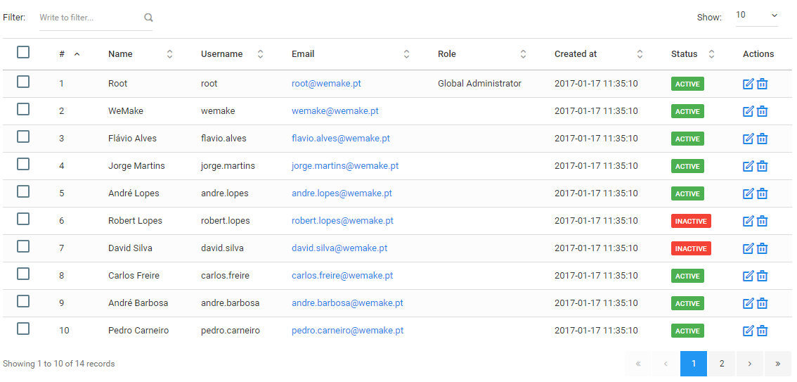
For a more in-depth guide check the datatable documentation here
How does it look?
When to use it?
You must use it in all listings
How to use it?
The datatable element must work with javascript on the viewmodel side.
On the HTML side
<datatable schema.bind="datatable" listing-id.bind="listingId"></datatable>On the javascript side
defineDatatable()
{
    this.datatable = {
        repository: this.repository,
        edit:       'administration.users.edit',
        destroy:    'administration.users.destroy',
        actions:    [],
        buttons:    [],
        selectable: true,
        sorting:    {
            column:    0,
            direction: 'asc'
        },
        columns:    [
            {
                data:  'id',
                name:  't00_users.id',
                title: '#'
            },
            {
                data:  'name',
                name:  't00_users.name',
                title: 'form.field.name'
            },
            {
                data:  'username',
                name:  't00_users.username',
                title: 'form.field.username'
            },
            {
                data:  'email',
                name:  't00_users.email',
                title: 'form.field.email',
                type:  'email'
            },
            {
                data:  'role',
                name:  't00_role_translations.name',
                title: 'form.field.role'
            },
            {
                data:  'created_at',
                name:  't00_users.created_at',
                title: 'form.field.created_at'
            },
            {
                data:  'status',
                name:  't00_user_status_translations.name',
                title: 'form.field.status',
                type:  'label'
            }
        ]
    }
}
Check the How To Datatables [insert link here] documentation
panel-group
How does it look?
When to use it?
How to use it?
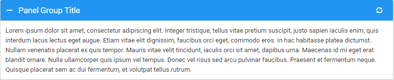
Basic usage
<panel-group header-title="Panel Group Title">
    <!-- Content -->
    Lorem ipsum dolor sit amet, consectetur adipiscing elit. Integer tristique, tellus vitae pretium suscipit, justo sapien iaculis enim, quis interdum lacus lectus eget augue. Etiam vitae elit dignissim, faucibus orci eget, commodo eros. In hac habitasse platea dictumst. Nullam venenatis placerat ex quis tempor. Mauris vitae velit tincidunt, iaculis orci sit amet, dapibus urna. Maecenas id mi eget erat blandit ornare. Nulla ullamcorper quis ipsum vel tempus. Donec vel risus sed arcu pulvinar
    faucibus. Praesent et fermentum neque. Quisque placerat sem ac dui fermentum, et volutpat tellus rutrum.
</panel-group>
Advanced usage
The panel group has 2 slots available, the main slot and the heading-elements slot
The main slot is where the content is rendered, you don't have to identify the slot, just put the content between the panel-group tags
The heading-elements slot accepts the heading-elements custom element tag and will render it in the top right corner. Check limitless heading options
Advanced Example
<panel-group header-title="Panel Group Title">
    <div slot="heading-elements">
        <heading-elements>
            <li><a data-action="reload" data-popup="tooltip" aria-expanded="false" title="Reload"></a></li>
            <li><a data-action="close"></a></li>
            <li><a href="#"><i class="icon-mention"></i></a></li>
            <li class="dropdown">
                <a href="#" class="dropdown-toggle" data-toggle="dropdown" data-popup="tooltip" aria-expanded="false" title="Menu"><i class="icon-three-bars"></i></a>
                <ul class="dropdown-menu dropdown-menu-right">
                    <li><a href="#">Action</a></li>
                    <li><a href="#">Another action</a></li>
                    <li><a href="#">Something else here</a></li>
                    <li class="divider"></li>
                    <li><a href="#">One more separated line</a></li>
                </ul>
            </li>
        </heading-elements>
    </div>

    <!-- Content -->
    Lorem ipsum dolor sit amet, consectetur adipiscing elit. Integer tristique, tellus vitae pretium suscipit, justo sapien iaculis enim, quis interdum lacus lectus eget augue. Etiam vitae elit dignissim, faucibus orci eget, commodo eros. In hac habitasse platea dictumst. Nullam venenatis placerat ex quis tempor. Mauris vitae velit tincidunt, iaculis orci sit amet, dapibus urna. Maecenas id mi eget erat blandit ornare. Nulla ullamcorper quis ipsum vel tempus. Donec vel risus sed arcu pulvinar
    faucibus. Praesent et fermentum neque. Quisque placerat sem ac dui fermentum, et volutpat tellus rutrum.
</panel-group>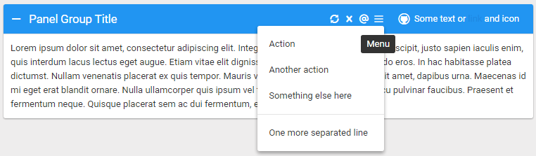
Options available
| Option | Description |
|---|---|
| header-title | Title for the header |
| collapse-group | Name of the collapsable group |
| header-class | Class of the header. Ex: header-class="bg-slate-300" |
| panel-group-class | Class of the panel-group. Ex: panel-group-class="col-md-8" |
modal
How does it look?
When to use it?
How to use it?
fancy-tree
How does it look?
When to use it?
How to use it?
tabs
How does it look?
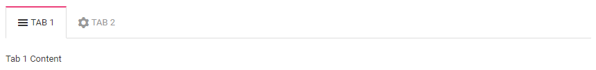
When to use it?
- When there's the need to have forms with a lot of information
- When we have interfaces with master-slave forms
- When there's the need to separate information
How to use it? The tabs element must be used in conjunction with the tabs-nav, tabs-nav-element & tabs-section elements
<tabs>
    <tabs-nav>
        <tabs-nav-element target="finding" icon="icon-menu7" label="Tab 1" classes="active"></tabs-nav-element>
        <tabs-nav-element target="actions" icon="icon-cog" label="Tab 2"></tabs-nav-element>
    </tabs-nav>

    <tab-sections>
        <tab-section section-id="finding" classes="active">
            Tab 1 Content
        </tab-section>

        <tab-section section-id="actions">
            Tab 2 Content
        </tab-section>
    </tab-sections>
</tabs>